Showing all 3 results

Joyagoo Spreadsheet Gallery Dept — Wearable Art, Batch by Batch
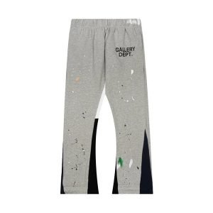
Gallery Dept. doesn’t make clothes — it makes arguments. Every piece is a statement about what fashion could be if it stopped taking itself so seriously: hand-painted jeans, reworked flannels, reconstructed denim that looks like it survived a garage explosion and came out better for it. On the Joyagoo spreadsheet, Gallery Dept. is one of those brands where the factory either gets the creative chaos or doesn’t — there’s no middle ground with art.
Josué Thomas built the brand on the idea of transformation — taking existing garments and reimagining them. That philosophy creates a unique sourcing challenge: the “imperfections” are intentional. Rips, paint splatter, and uneven distressing are features, not flaws. But there’s a line between intentional creative chaos and sloppy construction, and knowing where that line sits is what separates a good batch from a mess.
Paint Application: The Gallery Dept. Signature
Gallery Dept. is known for hand-applied paint — splattered, brushed, and dragged across denim and canvas. This isn’t screen printing. The paint should look organic and random, with variation in density, color, and direction. Here’s what to check:
- Randomness: No two paint splatters should look the same. If the pattern repeats, it’s a screen print masquerading as hand-painting.
- Paint absorption: The paint should soak into the denim weave, not sit on top like a sticker. Check this by looking at the reverse side — some paint should bleed through.
- Color palette: Gallery Dept. typically uses white, black, and primary colors (red, yellow, blue). The colors should be slightly muted/faded, not neon-bright.
- Edge behavior: Paint splatter edges should be feathered and irregular. Perfectly round dots indicate airbrush, which isn’t the brand’s method.
Construction Chaos vs. Sloppy Construction
This is the hardest judgment call in Gallery Dept. sourcing. The brand’s aesthetic includes raw hems, visible repairs, and asymmetrical details — all intentional. But good batches maintain structural integrity despite the distressing. The Joyagoo spreadsheet Gallery Dept listings we curate balance creative destruction with actual wearability.
Rule of thumb: the distressing should look like it happened to a well-made garment, not like the garment was poorly made and then distressed. Stitching should be tight even in distressed areas. Hems can be raw but shouldn’t be unraveling beyond 1cm.
Gallery Dept. Category Guide
| Item | QC Focus | Price (¥) | Difficulty |
|---|---|---|---|
| Painted denim | Paint randomness + absorption | 180-300 | Medium |
| Reworked flannel | Panel alignment + distressing | 120-200 | Easy |
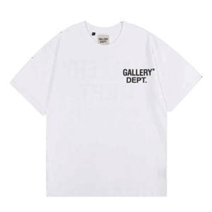
| Logo hoodie | Print quality + fleece weight | 100-170 | Easy |
Gallery Dept. Q&A
Is the paint on Joyagoo Gallery Dept. hand-applied?
Premium batches use actual hand-application — you can see brush strokes and splatter variation. Mid-tier batches use a hybrid of hand-finishing over a printed base. The randomness test (comparing two areas of paint) tells you quickly.
Will the paint wash off?
On good batches, the paint is acrylic fabric paint that bonds to the fibers. It will fade slightly with washing but won’t disappear. Wash inside-out, cold, and hang dry. Don’t dry clean — the chemicals strip the paint.
How distressed is too distressed?
If you can see skin through the fabric in more than 3-4 small areas, or if structural seams are compromised, it’s over-distressed. Gallery Dept.’s aesthetic is “curated chaos,” not “falling apart.” The garment should still be fully wearable.
“Art that kills. Fashion that lives. Only if the paint is real.”